


 By
By The call-to-action (CTA) is the linchpin of any B2B landing page. After you’ve taken all the steps to place your content in front of prospects, the CTA is the catalyst that moves them forward along the buyer’s journey, whether that entails turning prospects into sales-qualified leads or leads into customers. A good CTA maintains forward momentum by encouraging visitors to learn more and take the next step.
Its presence alone does not guarantee high conversion rates, so what makes a good call-to-action? Effective CTAs invoke a potent, positive reaction from visitors. That is something that comes from the placement, design, and phrasing of it as much as the e-book or demo you’re offering. Factoring in all of those variables, constructing the best possible CTA can be a bit more complex than one might think.
When creating new calls-to-action or revisiting your strategy for them, take care to address these four key principles:

1. Catch a visitor’s eye
The softer science elements—the design and language—of a call-to-action are often the most overlooked by B2B companies. Little things like the color scheme, size, and imagery of a CTA are big factors in improving its visibility and the response it generates. Website visitors have common patterns in how they scan a page and often look first at the same features (the first few lines of text, large pictures, header menus, and clickable buttons or links).
You don’t have to be a color theorist to know how to use this as an advantage (though you’ll certainly need a designer to execute it). Use contrast to make a CTA button stick out. For example, if your primary brand and webpage accent color is red, make your call-to-actions to a green within your brand’s color palette. Make it prominent in both size and placement on the landing page. Experiment with these things—and test their results—to make your clickable CTAs and sign-up forms grab a visitor’s attention.
2. Personalize everything
Whether you’ve fully adopted dynamic content for your B2B web presence or simply have segmented landing pages based on where a visitor is coming from, target CTAs to the prospects you’ve attracted and their needs. If you or your marketing agency are already running an advanced inbound operation, you may be aware of HubSpot’s smart CTAs, which personalize the offer that shows up based on a visitor’s context. That tool allows you to provide the right CTA for prospects with pinpoint accuracy.
But even if you’re not running a campaign on an enterprise-level platform, there’s still a lot of personalization you can achieve. Remember what brought a visitor here in the first place—the keywords you’ve chosen based on your buyer personas. Use those personas, coupled with your analytics and testing, to pair offers that are specifically relevant to the various B2B decision-makers with each landing page.

(Effective CTA Design from Deufol.)
3. Be concise and be relevant
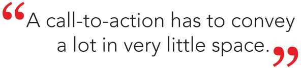
A call-to-action has to convey a lot in very little space. The content preceding a CTA carries the burden of supplying more detailed information, leaving your offer only the need to be pithy and clickable. Make it short, sweet, and clear about what is being given to visitors who click it—an elevator pitch, of sorts, in no more than six words.
Relevance comes from more than personalizing the demo, trial, e-book or consultation that you’re offering. It’s also about getting the phrasing and look right. Try framing CTAs using only the first-person possessive (“Start my free trial” instead of “Start your free trial”) to make it hit home. Using real photos (of people or picturesque places, especially) in your calls-to-action makes them more relatable and enticing than just using solid color or abstract pattern art. Consistency of voice and imagery maintains the inbound brand of your organization.
(Relequint hompage CTA)
4. Experiment
A more experimental way of thinking about B2B calls-to-action is to make them interactive. Quizzes, surveys and interactive demonstrations are unique methods that can be worth a try for B2B companies. Each are a way to explain product capabilities or glean the needs of visitors directly from their input. Having a CTA like this on your landing page as a feature that leads directly to your offer can be worthwhile if it fits the type of prospects you’re courting.
Making calls-to-action that convert B2B prospects into customers is about offering something of value and demonstrating that value in the most appealing way. Like with so many things in the world of inbound marketing, success hinges upon knowing who your ideal prospects are and what resonates with them. Good CTAs convert visitors by showing you know who they are, what they need, and why they’ve arrived on your landing page. Don’t be afraid to try new methods, test them and learn more about the prospects you’re attracting in the process. Don’t forget to tailor offers to the target buyer persona and use language that makes them feel as if you’re anticipating their needs. ![]()