


 By
By When running a B2B inbound campaign, the most tried-and-true way to gather emails, extend offers, and move leads further along the buyer’s journey is through landing pages. They are the conduit through which visitors enter as prospects and leave as leads. They also add momentum to a buyer’s journey, by allowing them to easily volunteer their contact information, share their needs, and learn more about the solutions you provide.
Effective landing pages can have different qualities based on the different campaigns a B2B company runs or the product or service they offer. But there are overarching qualities that apply to good landing pages regardless of their focus.
Here are the four key ingredients to landing pages that deliver high conversion rates.

1. Vital information at the top
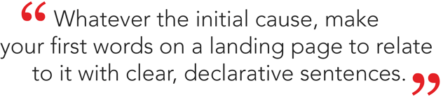
Don’t waste any time getting to the heart of the matter. Why has this person arrived on your landing page? Whether it’s from a PPC ad, sponsored social media post, website call-to-action (CTA), email or another part of your site, visitors reach your landing page after something else brought them there. Whatever the initial cause, make your first words on a landing page to relate to it with clear, declarative sentences.
(via: 16 of the Best Landing Page Design Examples You Need to See)
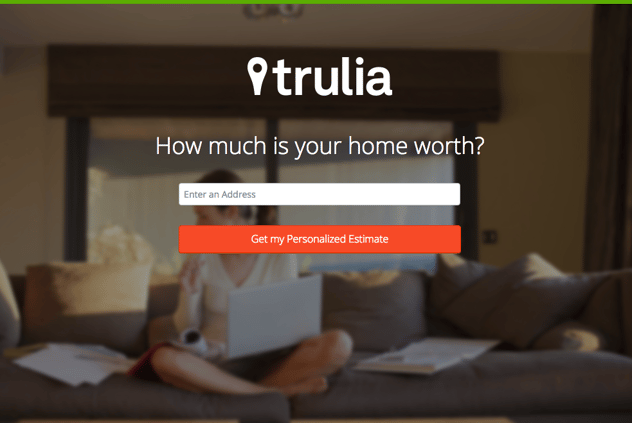
Use the space at the top of the landing page to reward a prospect for arriving. If they arrive seeking knowledge, launch right into a relevant post about the information they’re looking for and direct them to your CTA for more information. If they’re there to score a deal or special offer, get right to the CTA and give them details as to what it entails. B2B buyers are busy and you have to assume they’ll have the attention span of a goldfish—thus, place the most important parts of your landing page front and center.
2. Flow below the fold
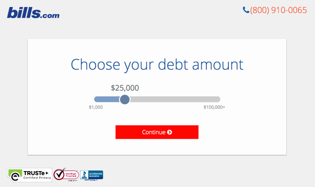
It’s not always necessary for the call-to-action on your landing page to be at the top. Depending on the information you’re trying to impart to prospects or the content you’re using, pushing the CTA below the fold (which is to say, anywhere a visitor has to scroll down to see when the landing page first loads on their browser) can be justifiable. The most important thing in this case is that you give buyers a reason to scroll down the page.
A potent below-the-fold CTA serves as a conclusion to what you’ve put forth on the rest of the landing page. If the CTA is a whitepaper, case study or consultation, use the landing page as a concise blog post putting forth the argument for its worth. Be economical with your words (again, assume short attention spans from your visitors) and use them all in service of building up what you’re offering in the CTA.
3. A direct CTA
No matter where you place it, the CTA is the linchpin of any landing page. In keeping with the theme of “waste none of a visitor’s time,” a good call-to-action uses brief, imperative sentences. Make it clear what the offer is, as well as the benefit of receiving it. Focus on assertive, positive language that motivates a buyer when they see it:
- “Learn about…”
- “Ask now…”
- “Get our…”
- “Use this…”
- “Solve your…”
Make your CTA a clear value proposition put into terms relevant to the prospects you’re attracting to the landing page. Avoid overly generic phrasing and aim to tailor the verbiage to resonate with your ideal prospects.
4. Clean, clear design
Clutter on your landing page is the enemy of good conversion rates. Nothing is more likely to produce high bounce rates and failed campaigns than a landing page that is confusing and ineffective at guiding visitors towards the CTA from the moment they arrive.
(via: 16 of the Best Landing Page Design Examples You Need to See)
It’s all about balance. Imagery is important on a good landing page, as it keeps it from becoming a daunting wall of text. But too much of it will cause a visitor’s attention to wander from picture to picture without ingesting any of the relevant content. If you have a lot to demonstrate visually, consider using an embedded video to get that information across without adding clutter.
Color is important too, but use it to highlight the most pertinent things. Embrace white background while using your company’s brand colors as an accent, such as placing your CTA in a bright red box that sticks out from the clean white background.
With these ingredients in mind, crafting a landing page that converts B2B prospects into sales-qualified leads involves a great deal less guesswork. Hit these crucial points and make adjustments based on your analysis of how ideal prospects are responding to the content and offer contained in your landing pages. It’s not a set-it-and-forget-it solution, but staying within these parameters allows you to make intelligent, quick adjustments for improving conversion rates. ![]()